At the end of 2017 I mentioned to Aislinn Chuahiock that I’d received some 35mm Kodak Portra 800 to test out and was planning on pitting it against Lomography’s Color Negative 800 in a side-by-side review.
In her infinite wisdom, Aislinn suggested I make it a three-way shoot out by adding a roll of Fuji Natura 1600 to the mix. It’s not a film stock I’d had much luck at that point with but since I had a roll sitting in the freezer and was testing the other two I thought, why not?
I received the (unlabelled) scans from the lab in January 2018 and as I was going to have to wait a while to get back my negatives, I was struck by an idea: why not do a blind review of the three films?
It seemed to me that a blind test without any brand bias informing my interpretation was the best way to approach the review I had initially planned and so here we are, I hope you find it informative.
Here’s what I cover in this article:
Shooting conditions
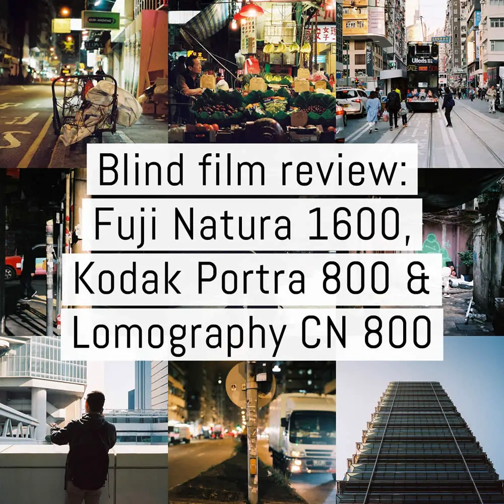
I shot the three films – along with a few others – while on trip to Hong Kong between Christmas 2017 and the New Year 2018. Although technically winter time, being in the tropics has its advantages and I was blessed with mostly clear skies and low winter sun for much of my time there.
Since shooting these rolls I had been busying myself with getting into the swing of 2018 and I had all but the fuzziest of memories about exactly which roll I shot where and when. I can tell you this however, each roll was fresh and once in my possession they were shot across three consecutive days on my Leica M6 TTL 0.85 with the wonderful 7artisans 50mm f/1.1 lens at ~f/4. I metered all the films at EI 800 so as to level the playing field a bit – some might say giving an unfair advantage to the Fuji. More on that later.
Each roll was half-shot during the daytime and half at night. After exposing 18 frames, I rewound each film, made a note of the frame number (~18), and then loaded in the next. Rinse and repeat. As night drew in, I loaded in each half-spent roll, advanced to frame ~19 and finished the job.
Location
I did my best to capture Hong Kong as I see it: a bustling hive of activity, human detritus with buckets of character. Hong Kong is a city of distinct zones of people, energy and cultures but that doesn’t really do it any justice.
For me, Hong Kong is a bit like home. The street signs, the pavements, the traffic lights, bollards, railings, they all remind me of London. It’s a place that invites you to explore and to try and do too much in one go.
It’s a place that makes me incredibly happy.
Results
All three films were sent off for processing within a few days of my return to home ground. As ever, they were developed in fresh chemicals and scanned on a Fuji SP-2000 scanner. The result posted in the six galleries below are all resized from the originals and 1200px on the longest edge. Simply click or tap on a thumbnail to open them full screen.
I’ve provided two galleries from each roll, one covering nine day time photographs, once covering nine shot at night: 56 photographs in total. The environments are all urban and for the purposes of this blind review, I’ve labelled the films in the same order of the generically numbered scan folders I received: “Film 1, Film 2 and Film 3” respectively.
Naturally, I tried to guess which was which as best as I could. I even enlisted the help of a few friends to weigh in. I’m happy to say that we were all wrong!
If you have a notepad ready for your off the cuff guesses, lets scroll down to begin…
Film 1: Daytime gallery
The first thing that jumped out at me was the grain…but not in a great way. Being either a native 800 ISO film or a 1600 ISO film over exposed a stop, I was expecting a degree of softness but the grain in less than optimal light was distracting to say the least – see image 3 in the gallery below for an example.
The grain was still quite apparent under brighter light but minimised somewhat by the lovely bright reds, oranges and yellows. Although these brighter colours helped to take the focus off the puffiness for a while, there was another issue for me: blacks…
Not having much experience with high speed colour film, I’m not sure exactly what I was expecting but blacker blacks were definitely on top of my short list. The small gallery thumbnails below might look pretty good but take a minute and click on one and view it in full screen. You’ll see what I mean.
Still, those reds, oranges and yellows really did pop in bright light and for what it’s worth, I don’t count this roll as a total bust, especially considering the greens are pretty much spot on 100% as seen by my eye.
Would I buy it again based on these results, I’m not sure. The grain was far too distracting for me. Perhaps it’s a film more suited to landscape photography?


Film 1: Night time gallery
On to the nighttime half of this roll and things are a little bit different.
The bright white and warm yellow street/store lights cast a lovely glow on this film and I love the way greens and blues under indoor lighting almost fade to grey-green. It’s still a puffy film and as frames 7 and eight below demonstrate, even shooting at “box” speed (7) needed a bit more light – frame 8 was overexposed a stop.
The grain from the daytime shots was still there but with everything bathed under artificial light, it’s a little less jarring to my eye. You make the call.
I’m still not 100% sold on this becoming a go-to film for night time photography but the film stock certainly recovered a few points for me based on this gallery.


Film 2: Daytime gallery
I absolutely loved the scans when I first flicked through them on my computer, frame one especially was a welcome change from the same mixed direct/indirect shots from the previous roll.
As expected there was grain but the shadow areas were a different story compared to Film 1. Where Film 1 had a murky, muddy quality to it, this film didn’t “fuzz out” in the shadows. Yes, I understand that’s not a great technical term, so please reset your expectations for a more subjective review from here on in.
The daytime shots – in particular frames 5-9 – provided natural colour tones in all but the harshest of light. In the case of these (6 and 7 especially), you can see how reds and greens really come out to play.
Based on the way the sky was rendered in frame 5, I had an idea of what this film might be but frame 6 totally scuppered that thought.


Film 2: Nighttime gallery
What can I say? Rich colours, deep blacks and plenty of detail. In my humble opinion, the night time results of this film are fantastic. With my expectations from any fast colour film firmly set by the previous roll, I have to admit that I was very, very pleased with the results. There were definitely more keepers from this roll’s night time photos than the last and I was very pleased by the level of detail the film retained.
Again, in comparison to Film 1, night time colours retained a natural tone (no fade to grey), although there are a number of examples where the film produced some great saturated colours under the yellow street lamps and very bright, brilliant white LEDs.
Of the two films so far, this one sticks out to me as the best all-rounder.


Film 3: Daytime gallery
Let me share a secret with you, I initially had this film pegged as Fuji Natura 1600. Perhaps it’s wrong of me to say that now, as if you’ve been paying attention you’ll know that I was wrong about all of my guesses but what’s done is done.
The pinks and greens of frame five below really sold me on this film – one frame and bang, I’m done. Love it.
As with Film 1, the blacks aren’t as deep as I would like, although the shadow area grain isn’t as distracting in my opinion. Just like Film 1 and 2, colours popped in bright light (those reds again) but truth be told, I wish I’d done a better job of shooting more varied scenes with it.
Gran wise, this film sits somewhere between Film 1 and 2 for these daylight shots. There’s less “bleed” and “smudging” to my eye – whatever that might mean to you.


Film 3: Nighttime gallery
As with the day time shots, this stock appears closer to Film 2 than Film 1 in the way it deals with colours in low light. Still, when we’re talking about blacks, they aren’t as rich. See frames 4, 5 and 9 respectively.
Colours are natural and don’t fall into that “grey-blue tone” of Film 1; and I’m hard pressed to consider a scene from those below that doesn’t appear – colour-wise – as it was the night I shot it.
Another thing that surprised me was how sharp the film was at night. I was shooting mostly at f/4 but there still loads of detail to be had (if that’s your thing).


The reveal: which was which?
So…any ideas? Write something down on a piece of paper before you scroll down and please, if you’re sharing this review on social media, etc., please don’t spoil the results. I’d love as many people to see these frames blind, just as I did, and make up their own minds.
I wrote this review/comparison not knowing which of the three stocks each of these sets of scans were. I also went to great pains to ensure I didn’t see the negatives before I finished writing this article (Mrs. EM held them with an iron grip until I showed her this paragraph).
The reveal is below but you’re going to need to jump through a hoop or two to see the results: highlight the two blocks of BOLD text below and the film names will magically appear.
If you can’t see them clearly (iOS users), just highlight, copy and then paste it somewhere.
<<< USE YOUR MOUSE/FINGER TO HIGHLIGHT TEXT FROM HERE >>>
Film 1: Fuji Natura 1600 (shot at EI 800)
Film 2: Kodak Portra 800 (shot at EI 800)
Film 3: Lomography Color Negative 800 (shot at EI 800)
<<< … DOWN TO HERE >>>
Surprised? I was a bit.
Conclusions
Let me start off with a quick aside: I wish I’d had the wherewithal to shoot a roll of 35mm Cinestill 800T at the same time at these three. I kicked myself for not having done so but only after I had returned. Next time.
On to the three that were shot and I have to say that I was incredibly disappointed with my Natura 1600 results once again (Film 1). This was my third roll and likely my last, which is a good thing, as it’s now discontinued. If you like the results you see here then I encourage you to give it a try. You have nothing to lose but money.
When speaking about results alone, it was a tough call between Kodak Portra 800 (Film 2) and Lomography Color Negative 800 (Film 3). Especially when considering only brightly lit subjects. Aside from the lack of deep blacks in shaded areas and a slight softness to the Lomography film, both stocks looked very similar in terms of their grain structure, tone and overall feeling.
The nighttime images from each stock were a bit of a giveaway, however, and when comparing these two rolls, my past experiences with the Lomography film in 120 format were enough to act as an artist’s stamp on each frame. There’s a certain quality and refinement which Portra brings to the party that Lomography’s film gets close to but never quite matches.
Portra 800 renders natural and almost understated colours during the day but at night, has the potential to become a vibrant, saturated film that absolutely does justice to the riotous colours of Hong Kong’s night markets – in the case of this roll at least.
Night or day, the film gives you an assurance of consistent quality. Or to put it another way, it’ll take whatever you throw at it and throw it back in your face laughing and screaming, “IS THIS ALL YOU GOT?!”
Portra 800 does not benefit from the Kodak Motion VISION3 special sauce added to Portra 160 and 400 a few years ago. To my mind, that makes the night time results all that more surprising. It behaves more like a colour motion picture film than I expected and I would be very happy to shoot it almost exclusively for my (admittedly limited) night time photography from here on in. Did I say I’m very impressed?
BUT…this is a two-horse finish and Lomography Color Negative 800 film also has a night time character that can’t be dismissed. It’s pretty great at grabbing natural colours and although it swings a bit towards yellow under some light, AND has a slight issue with retaining those black blacks, messing with the sliders in Lightroom will bring them out if that’s your thing.
For me, the greatest deciding points between these Kodak and Lomography stocks boils down to two things: price and quality.
The allure of Lomography Color Negative 800 is the price point. In most territories, a 35mm format a three pack of this film is priced at a little over a single roll of Portra 800.
The allure of Kodak Portra is its rendition: excellent grain, accurate but vibrant colours and wonderful, deep blacks are all there waiting for you. If you want the opinion of this particular photographer, I’d play with the Lomography but work with the Kodak.
~ EM
PS. Newer batches of 35mm Lomography Color Negative 800 are not DX coded, which I assume is rather important to most of the people wanting to buy and try it. If you’re shooting this film in a compact camera with no manual ISO override, you’ll be stuck at whatever default speed your camera gives you. My advice is to shoot with an SLR.
Share your knowledge, story or project
The transfer of knowledge across the film photography community is the heart of EMULSIVE. You can add your support by contributing your thoughts, work, experiences and ideas to inspire the hundreds of thousands of people who read these pages each month. Check out the submission guide here.
If you like what you’re reading you can also help this passion project by heading over to the EMULSIVE Patreon page and contributing as little as a dollar a month. There’s also print and apparel over at Society 6, currently showcasing over two dozen t-shirt designs and over a dozen unique photographs available for purchase.


30 responses to “Blind film review #01: Fuji Natura 1600 vs Kodak Portra 800 vs Lomography Color Negative 800 (35mm)”
Now we are in Feb. 2022 and here is the current price comparison of Portra 800 and Lomography 800.
Unless you buy from a small shop that sells single rolls, Portra 800 in 120 format is only available in 5 packs that cost $65, or $13/roll. You can buy single 35mm rolls of Portra 800 for $15.95.
Unless you buy from a small shop that sells single rolls, both 35mm and 120 format Lomography 800 film comes in 3-packs. 35mm costs $34.90, or $11.63/roll, and 120 costs $27.90, or $9.30/roll.
While there is no longer as drastic a cost savings to be had by buying Lomography 800 instead of Portra 800, as was mentioned in the article, the Lomography film is still significantly less expensive per roll. At this level of savings, you can shoot 4 rolls of Lomography 800 for every 3 rolls of Portra 800. Sounds good to me.
I totally called it! Picked out the film’s by just skimming the photos.
Jesus, those scans were bad in the slide show (however they were compressed). I wish articles like this would come with a disclaimer that reads *we don’t really know what we are doing. You think that was ‘film grain’?
“PS. Newer batches of 35mm Lomography Color Negative 800 are not DX coded, which I assume is rather important to most of the people wanting to buy and try it. ”
Just bought a bunch of Lomo 800, expires 2021, and it is all DX coded.
It’s a pitty, that you didn’t included also Cinestill 800, I see very good photos shot at that film, so it would be cool to see it in comparison with other. I have one waiting in my fridge, but as it’s only one roll, and as it’s a bit more expensive, and I can get it only online, I am waiting for the right occasion to give it a try… but I am very excited.
From the results, I am not much surprised. I liked Portra shots most, and I knew that it’s Portra. It’s a bit cliché, but there is some reason, why it is so popular. Natura is a bit unsharp and grainy, but at the other side, it has very distinctive character, which you just can’t replica on digital camera. Lomo looks good, particulary for that price.
Those Superia shots look really underexposed. Seems like something was up with that batch or that roll, as it doesn’t correspond to what I’ve seen from that film
Yeah, I knew 1 would be Fujifilm Natura 1600 – that film produces awful results for me too! I also knew 2 would be Portra 800, that is a fantastic film that produces results that knock me out with their wonderfulness. But the price is insane! I did not know about the Lomography film, I’m really impressed that it almost matches Portra 800. Great work!
The Lomo is very, very close to Portra. surprised me too. Hope you’re well Ray!
It’d be nice to see a comparison of Portra 800 compared to Fuji Xtra 800 – Is Lomographys film probably just a rebranded version of this? They don’t make their own stock after all?
Andrew, Lomo’s is made by Kodak, evident from the markings. All their Color Negative series, at least in 135, is supposed to be Kodak Gold
Fab review, thanks! Maybe i’m in a minority here but…I think a lot of grain in colour images can sometimes look great. I’m thinking of the punchy ‘toxic’ (lol) ultra-grain of Adox color implosion (RIP) – i’ve had some really interesting results with that. I also love the results i’ve had with Natura 1600 at night – the grain adding to a gritty look I think perfect for certain places at certain times (OK, i’m mostly thinking neon-lit dirty places with tons of character!)
I recently shot a roll of film called Sayat Nova (can’t find much info about it online, who makes it, if it’s treated old stock like color implosion etc). I shot it at the suggested box speed, ISO640, and it is so exceptionally grainy and saturated the best of the shots were reminiscent of little pointillist tableau.
FYI just got two packs of 800 from lomo , so 6 rolls and it is DX coded
Woo.. 3 out of 3. Give me the prize lol. Natura is pretty obvious. Nothing can beat its vibance, especially in red.
@KodakProFilmBiz @lomography I managed 1 out of 3 right, if I had gone with my first thoughts, would have been 3 for 3
@KodakProFilmBiz @lomography I got them all right! Very nice write-up and always glad to see people s… https://t.co/lEj39raLV3
@KodakProFilmBiz @lomography Fun review! Did you in-camera meter, handheld, or use the Force?
@KodakProFilmBiz @lomography Just shot some Portra 800 and it looked great at 200. Closer to box spee… https://t.co/7FneseCeEn
Excellent work
@KodakProFilmBiz @lomography Interesting results. I have 2 rolls of Natura waiting for the night fire… https://t.co/W5qfDgFioQ
@KodakProFilmBiz @lomography Wait, did you shoot the Natura at 640ASA native speed, or 1600ASA DX speed?
@KodakProFilmBiz @lomography I got it right! Wooooo!
@KodakProFilmBiz @lomography Great review, I’ve been shooting a bit of the Lomography 800 lately, and… https://t.co/gyrHUK6xEw
@KodakProFilmBiz @lomography Loved the review EM!
Glenn Joseph Vee Guiruela
@KodakProFilmBiz @lomography Interesting. But why include Natura 1600 rather than Superia 800?
Yay, i’ve guessed it right! o/
After shooting a lot concert pictures with the Lomo 800, i can agree… https://t.co/d0wDaYtNX4
@KodakProFilmBiz @lomography Didn’t get any right, but still a great article. I currently have 2 roll… https://t.co/n5PQabT8p7
Super useful review. I just shot one of my last rolls of Fujifilm Superia X-tra 800 yesterday and was wondering what I’d move to after they’re all gone. Looks like I need to buy some Portra 800 and some Lomo 800 and try them.
@KodakProFilmBiz @lomography I had no idea tbh not having experience in colour to speak of. Film 2 looked nicest to me.
@KodakProFilmBiz @lomography Fun to play along with the blind review. Got one right but had no idea o… https://t.co/4HbvQpUYad