The road to this photo book wasn’t paved in roses exactly – more like sea salt! – but it did all start with a rose garden, or more precisely with a first pinhole image of, as it turned out, yellow roses: aka how I began shooting pinhole seascapes in the first place.
For fourteen years I had a little Zero Image 2000 pinhole camera tucked at the back of my closet while I was doing other stuff – literary research, Sumi-e painting, vintage lens camera “sampling”. One day I took it out for a test drive at a nearby rose garden and fell in love with the painterly aspect of the images, so different from the lifeless digital images I’d been getting with my Sony camera.

I next took the little Zero Image to the shore, tried different films, different formats, panoramic pinhole, blender pinhole…and quite a few more variants (alas, I have yet to meet a pinhole camera that I do not like!)


Still, the square remains my favorite. The 6×6 cameras are always the lightest and smallest, the 120 format yields a whopping 12 images per roll and the square itself has a wonderfully calm, yet assertive presence on both screen and paper.


I have never quite experienced the famous composing problem with it because my pinhole cameras have no viewfinder in the first place! Having recently used a TLR, though, I am beginning to grasp those composing issues people keep on about! Luckily the Rolleicord screen is so dim that I cannot really obsess about it and so I still rely on mental “square” visualization, even with a lens camera.
It took me some time to find my photographic grail. Although I had already gravitated to the sea shores, it was a five-day workshop in Normandy with pinhole artist Annick Maroussy which made me get serious about it. After schlepping the 4×5 box, ten holders and a sturdy tripod over slippery rocks and steep cliffs to shoot the Atlantic sea, hiking to the Tel Aviv-Yafo harbor carrying nothing but a flimsy tripod and a tiny 6×6 pinhole camera was a piece of cake! The Normandy workshop was also about Direct Positive Paper.

I fell in love with it and still shoot it for other subjects, mostly Riverbank trees, but the combination of Mediterranean light and square format spells color to me. More specifically, Kodak Portra film. Sometimes Ektar gets in too.
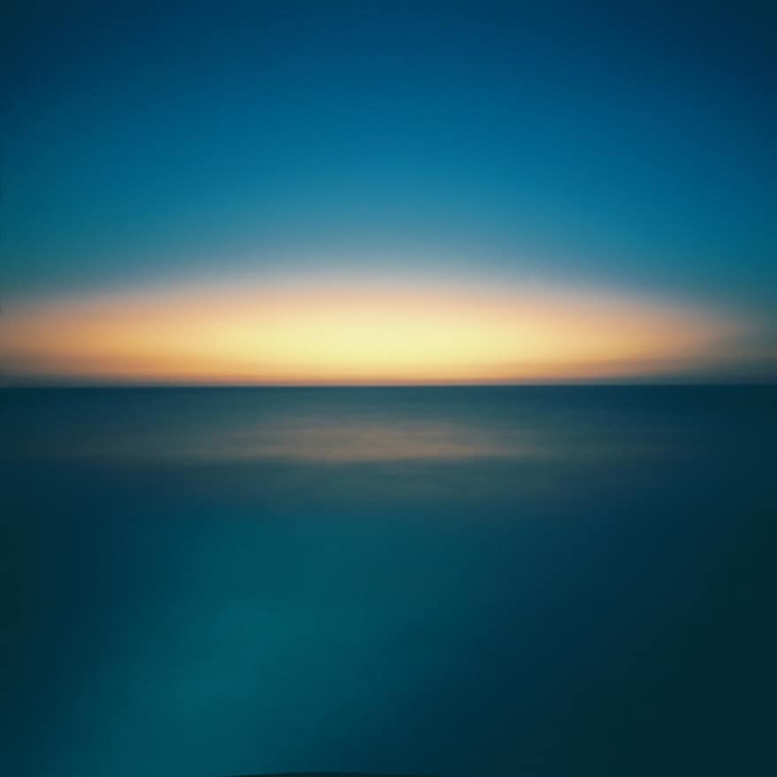
The characteristics of my seascapes – super colorful – often wistful 6×6 squares – stem from my fascination with the eerie soft luminosity at the merging point of sea and sky. The beauty of that inaccessible horizon line draws me over and over to the harbor with my pinhole cameras. I seldom shoot less than a roll of twelve frames in a single session. I often shoot more.

The photo book, initial and final versions
The first version of Vues sur mer contained about half the number of images, interspersed with black and white pictures of the surrounding scenery – artefacts and passers-by.


There was a tension between the colorful seascapes and the BW images. The latter were in various formats, telling a story anchored in a place and time, while the all-square color seascapes were an escape into the horizon line.
Keith Mendelhall, who handled the graphic design and did a great job at it, was almost done and hinting broadly about final deadlines (by then I had changed my mind quite a few times about the image selection and order). But I was still shooting daily at the harbor, and as the seascapes multiplied, it became apparent that they needed no narrative crutch and worked best as a self-contained sequence made of smaller sequences, like a flattened Hungarian cube. Nothing but sea and sky and the occasional rock, a cube of seascapes!
The new presentation had the seascapes ordered in series of four, two per spread, each series from a different day. The variations between the images are subtle. The movement of a cloud. The delicate gradation of color on the horizon. The reader is meant to slow down, to compare the images, to hunt for differences – if you don’t double check to make sure I haven’t used twice over the same image, you haven’t been paying attention!
Also, the serial constraint created a dominant mood: Serenity.
Only calm, wistful and uncropped square seascapes got in. Anything remotely harsher, such as 3D or redscale seascapes, which Keith rather liked and wanted in, or the occasional 4×5 seascape which I pushed for and briefly considered cropping, was invariably spit out by the book. The final 67 images (cover spread and frontispiece included), although quite varied in film types and cameras used, work in harmony much like a continuous visual meditation, simulating the progression of a single summer day from morning to sunset.


I had decided to print a limited edition of 100 books so that I could allocate more budget to using high-quality materials and finishing. I chose offset printing on matte Gardapat Kiara 150 g/m paper at French fine art Escourbiac printer. The end result is an exquisite soft sewn cover 80-page little book-object (bigger sized prints on archival quality art paper are also available).
Looking now at the finished book, it feels like a one-time endeavor to me. Not because I have stopped shooting seascapes with my pinhole cameras, but because this book encapsulates, quite literally, the memory of summer 2017: the unique experience of an almost continuous pinhole session lasting throughout an entire Israeli summer.
Thanks for reading. There’s more about the book format, first readers’ feedback, and ordering information at https://www.vuessurmer.org.
~ Daphne
Share your knowledge, story or project
The transfer of knowledge across the film photography community is the heart of EMULSIVE. You can add your support by contributing your thoughts, work, experiences and ideas to inspire the hundreds of thousands of people who read these pages each month. Check out the submission guide here.
If you like what you’re reading you can also help this passion project by heading over to the EMULSIVE Patreon page and contributing as little as a dollar a month. There’s also print and apparel over at Society 6, currently showcasing over two dozen t-shirt designs and over a dozen unique photographs available for purchase.


5 responses to “Vues sur mer”
Thanks ever so much Michael, happy you liked
thanks Stephen! looks like i’m the only one not seeing any pictures ?! the book url is correct so probably a certificate related issue too?
Fantastic images and storytelling.
Fantastic project, images and story-telling.
Dreamy pictures Daphne…
Tried to see about the book but my browser rejected your URL?