In this article, I talk about my progress so far on my quest to make art for the living room wall. In this, part 1, I cover making an initial contact print, and through my process of iterating test prints to a “final” outcome. I put “final” in double-quotes because, well, you’ll see!
I hope this documentation is useful to you, whether you are just getting started with darkroom printing, have been doing it for years, or are coming to this page without even knowing what a darkroom, traditional silver gelatin printing, or “wet” printing are.
Welcome!

By way of an introduction, I took a photography course in high school when it was still taught with film. Digital cameras were only available as 1MP point-and-shoots at the time, and the course was all about taking pictures — no developing or printing. We would buy whatever colour film was the cheapest at our local pharmacy, shoot our assignment, take it back to the same store where they would mail it off to get developed (it was a small town and they didn’t even have a minilab).
We would get our prints back a week later and hand them in. At the end of the second (and final) year there was a unit on darkroom work. I was looking forward to this, but my teacher, Mr. Stone decided that after teaching this course for 20 years it was time to do “digital darkroom”. I was disappointed — I had a scanner and photo-editing software at home.
I didn’t take pictures after that course was over as I didn’t have a camera of my own or money to buy film and pay for development. I took up digital photography in 2009. I liked walking around and taking pictures, but with no use for the photos I took, I lost interest after a couple of years.
A year ago I had a darkroom video show up on my Youtube homepage and subscribed to Roger Lowe’s “Shoot Film Like a Boss” channel. I didn’t realize film photography was still a thing. Could I set up my own darkroom at home?

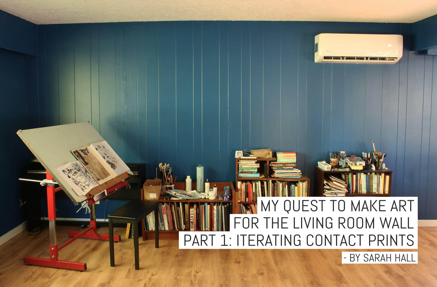
I had recently (two years previously!) painted the upstairs walls in my house deep blue as I thought the colour would be a great backdrop to hang art against. It seems no one has art in their house anymore. I’m not sure if “anymore” is the right word though — when I was young the only “art” on the wall came free when my parents bought the couch. I was raised in a farming family where art was not useful for anything and, therefore, held in low esteem. I did well at math and science and went to engineering school, but took an interest in fine art at some point.
For some reason, I found it more challenging trying to figure out how to make an image that appeals to someone. I’d been looking at paintings, reading art books, watching drawing and painting videos on Youtube, and thinking about making art for years, but not actually making much. My expectations of myself were too high, I just kept failing, and I felt that the goal was too far away. Could I modify the quest? Could I make darkroom prints to hang on the living room wall?

I bought a basic 35mm darkroom set up for $120 and a Minolta SRT101 and have been working on my self-appointed Quest for the last six months. I’ve since acquired more cameras and (too much) equipment, including an Omega D2 4×5 enlarger (the first picture above). The progress I have made in those six months looks, at first, to be insignificant — I can take a picture and print it. This is something someone with no training or knowledge can do with a cell phone and printer in seconds. However, back when analogue was the only option I imagine it was quite an accomplishment to learn to take decent exposed pictures, develop the film at home, and make a good quality print. We’re seriously lucky these days to have access to so much information on the internet.

I hope to write a series of articles journaling my progress on The Quest. So far, I’ve only been making black and white 8×10 prints, so I’ll go over the darkroom process I’m using to make those.
In the beginning there was…
I start by making a contact sheet of the whole roll. I leave the film in clear polyethylene sleeves to make contact sheets. It’s a lot quicker than feeding the strips into one of those proof printers, and a lot less fiddly than going without sleeves or a proof printer and trying to arrange the strips on top of the paper and having them move around when you put the glass on top. The quality of the print isn’t a big deal when making contact sheets — I just want to see what the negatives look like.
I start by doing a test strip. A strip of photo paper (I used ILFORD MG RC for everything here) goes on the table, then the sleeve of negatives, then the sheet of glass.

Twenty-five seconds looks about right, but these negatives aren’t very evenly exposed, so I do another test strip at 25 sec.

It looks good, but maybe a touch too light, so I did the contact sheet at 27 seconds.

I guess I was swayed by the two frames in the middle which are more dense than the rest, so the print looks a bit dark overall. But it’s just a contact sheet. For the purpose of this article, I want to talk about my process for the urchin (top row, third from the left), and leaf (middle row, also third from the left).
Urchin Print
I liked the shot of the bottom of the sea urchin, so I put the negative in the carrier (currently just 2 pieces of cardboard with a 6×6 cm hole in) and did a test strip. I only have two lenses for my enlarger right now: a 50mm and a 150mm. The 50mm won’t cover a negative that big, so my only option is the 150mm. This works, but because the head of the enlarger has to be so high to make an 8×8″ print exposure times are longer.
I started with a contrast 2 filter, as Ilford says this is the “standard” filter, meaning it won’t increase or decrease the contrast of the neg, but print is “as shot”.

Eighty seconds looks too dark. It’s hard to tell if 60 secs looks okay because there’s not much detail in the picture there to judge by, so I did a test at 60 secs.

The darks look to be in the right place, but maybe the whites are a bit washed out, so I tried a contrast 1.5 filter.

The whites seem to be in the same place, but the darks are way lighter, so I tried a longer exposure.

Still too light at 90 seconds. I switched to f/8 to half the exposure times.

Everything looks too grey. I decided I’d gone too low with the contrast filters, so went up to a contrast 2.

Getting much closer. I can’t tell the difference between the 50 sec side and the 60 sec side. I did a full 8×8 print to see how this looks.

This is clearly too dark.
I realized at this point that I’d been holding my test strips too close to the light bulb in my darkroom when judging them for exposure and focussing too much on every minor form in the highlights being clearly distinguishable, and not on the read of the whole picture.

Still too dark at 40 secs, though I chose the wrong place in the print to make the test strip (this is the bit of the urchin with a dark local value).


Exposure looks good at 24 secs, but the print isn’t sharp, probably due to the table or enlarger head moving slightly. I had the enlarger head as high as it could go to make these with the 150mm lens.

This print came out very sharp, but looks lighter than the previous one (and therefore flatter). This is probably down to the fact that I don’t have a timer for my enlarger, and am using a digital watch and the on/off switch. It’s easy to lose track of what you turned the enlarger on and when you need to turn it off, and then there’s the mistakes that arise from doing math in my head. I need to get a timer.
I ended up going in a loop with this print – my first test strip is barely distinguishable from the final print. I get confused with the contrast filters. According to Ilford’s technical information, “MULTIGRADE filters are very easy to use: no complicated calculations are needed when changing from one filter to another. The exposure time for filters 00–31/2 is the same; that for filters 4–5 is double”. I don’t find this to be the case; maybe I should test it. I am also using rubber bands to hold the filters under the lens as I only have the 3″ set, and for them to go above the lens on my enlarger I need the 6″ set. I have a hard time getting them to sit flat under the lens with the rubber bands, so I could see that having the filters curved could have an effect.
I can’t put the filters above the lens but below the condensers as I’m using a homemade lensboard, and the lens always ends up in a slightly different place after taking it out and putting it back, meaning I have to reframe each time.
I considered burning in the background to make it a more even tone, but decided to leave it where it is. There are a few things on the negative I’m not happy about and would reshoot if I wanted to make a print for the wall:
- I got the focus wrong – I calculated depth of field so that the whole of the urchin would be in focus but not the background, but forgot to re-focus further down, so the edges of the urchin are out of focus, leaving a blurry silhouette
- I would rotate the urchin so the dark local value was against the side of the lighter background
- I would try to make the fall-off of light on the background more gradual so I had a more of a gradient
Leaf Print
I started at f/8 this time, as this negative is obviously denser than the last and will need more light. It’s commonly stated that a lens is sharpest 2 stops down from its max aperture, (which would be f/11 for this lens) but I’ve yet to test that. The lens is a Taylor Tayon, which I believe is a rebrand of some cheap lens from ages ago.

Still too light. Going to f/5.6.


Needs more contrast.


My quest to make art for the living room wall – Part 1 – Leaf 006
Looks good, but I’m going to go back to f/8 for the print, which is 100 secs.

Looks good, but I decided to try dodging the bottom right to make it lighter and burning the top left to make it darker.
I did a test in the top left to see how much time that area wouldn’t need overall to bring it up to the desired darkness.

“70” above seemed about right, as I still want some variation in the background (meaning 140 secs at f/8). I took a guess on the time for the dark corner. So this is my diagram for how many seconds overall each are of the print needs:

And here’s the final print:

I was happy with this print. I rinsed all my prints in the laundry room (no sink in the spare bedroom that I’m using for a darkroom), and squeegeed them off in the bathroom shower and hung them to dry. I obviously took them down too soon as some of my prints stuck together when I stacked them. I tried soaking them but they wouldn’t come unstuck. Some of them also warped — the lighter areas on the final print that radiate to the top and bottom are not there in the actual print, this is because the print wouldn’t lie flat on the scanner.
Oh well.
While I gather the things I need to make bigger prints (big paper, big trays, enlarger timer, enlarger lens for medium format negatives, an easel, something to squeegee prints on, and a drying rack), I’m going to explore whether paper negatives are useful in making final prints. In the next part, I will present the results of my comparison of film negatives and paper negatives, with a pinhole experiment thrown in as a bonus.


One response to “My Quest to make art for the living room wall – Part 1: Iterating contact prints”
Best article I’ve read in years. Interesting, informative, and charmingly well written. Thank you Sarah.