Photographs become something special when printed. You can touch them, feel them, and get up close to them. And you can show them to others in a format that they understand… a book.
It’s a really special moment when you see your pictures in print. You feel proud, excited and reinvigorated, and you also feel that the pictures now have a purpose. That’s why it’s important to look into printing your pictures. With the proliferation of online publishing and printing tools, it’s easy to get your work to print.
But it’s also easy to do your work an injustice, with a poorly thought out and designed photo book / zine. With that in mind, I’ve put together a list of some creative do’s and don’ts to help you make a book/zine/chapbook – whatever you want to call it – that isn’t a pile of expensive crap.
Despite having over 25 years of experience in design I’ve been guilty of it myself- getting excited and carried away, making daft mistakes and then receiving my expensively printed work in the post and thinking: “Fuck, why the hell did I do that?”
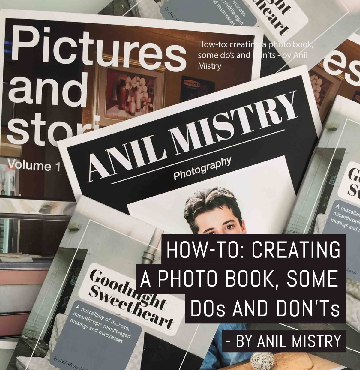
Printing is expensive, and putting a book together is time-consuming – so here are some tips for you – I’ve also added some images from one of my books to show examples of where I feel I’ve got it right and wrong.
DO look at lots and lots of photo books
This is absolutely key. You may be a great photographer but you’re probably not a great designer or editor. So get to a bookshop, get online and take a hard look at what’s out there.
How have people constructed their books? What makes a particular book or books special? How have they been designed? How have they laid out text?
You will usually find that good books have good photographs, a clearly constructed story/flow AND a simple, intuitive layout.
Don’t be afraid to take influence from those you admire. If this is your first book, the fewer risks you take the better. There are many conventions in book design that you can learn from.
Remember: You should be asking a lot of questions: how have people titled their books, who’s written an introduction that engages you, and how have the best pictures been laid out and annotated?
DO have a clear idea of what your book is for

Is your book a personal portfolio, showcasing your work to potential clients, or is it a project you’ve been working on that’s now ready to share with the world?
A portfolio/ showcase is a straightforward attempt to show your work at its best. So to that end, it’s useful to categorise your styles of work in sections to avoids confusing the client. A personal project requires more of a story to it, to bring your work to life in the way you want people to understand it.
Remember: Portfolio = work / Project = work + context.
DO plan your pictures out beforehand
You probably think that you know your work so well that you can just drop it into a template and hit print – but your book needs to have a flow to it and it needs to avoid repetition or “sameness”.
If you can, print your pictures out and do a “paper edit” at home: lay them on a table and see how the way you order them changes the feel of the book. Once you start dropping images into a template it’s not easy to retain that “global” view – and the flow of the book is everything.
Remember: You are taking the reader on a journey, and it should be one that engages with every turn of the page. The human eye likes variety.
DO write an introduction

You need to provide a clear context and framework through which people see your pictures. So be clear and engaging, so that the reader understands you and what you are trying to say. A basic introduction framework could be:
- Who are you?
- Why did you make this book?
- What challenges did you encounter whilst making it?
- What do you want the reader to understand from your work?
Remember: Not everyone reading the book will be familiar with you or your photography.
DON’T waffle on
There are a lot of ‘zines full of pretentious nonsense out there. Sometimes a grainy black and white photo of an abandoned barn is just that and can be appreciated with no need to be surrounded by verbal crap.
Remember: If the pictures can talk, let them.
DO get a bunch of people to look at the book you’re putting together

Not sycophantic ones who will spare your feelings and just agree with you, but blunt ones who will be honest about what they’re seeing. It’s easy to think that every shot you want to put in the book is a keeper, but objectivity is essential.
You are the last person who can be objective about your own work. So if your friends aren’t sure about a picture, just drop it. 2 or 3 mediocre pictures can bring down a book and destroy its impact. Leave people wanting more.
Remember: Every picture you put in is saying something about your “eye”.
DON’T go font and layout crazy
Books are RUINED by poor choices of typeface and layout. Adding a crazy font is more likely to make your book look amateurish, and sticking images in random boxes all over the pages will look CRAP. A lot of online publishing templates are full of wacky layouts that print across a page fold and bleed off the edge.
My advice is to always leave a white border around every image and to reduce your typeface usage to one or two in total. Overly-large font sizes will wreck the impact of your book, so keep your copy quite small. If this is your first book, I’d suggest sticking to black text and avoiding any colour.
EVERY piece of design you add to your pictures risks detracting from your pictures, so tread very wisely with the way you title and annotate them.
Remember: Don’t be afraid to take inspiration from the layout or style of another book. Keep it simple and elegant but keep it yours.
DON’T go glossy

Glossy finishes look and feel crap.
Gloss finish is not cool anymore. Go for a matt / uncoated finish if you can, or a satin finish if you absolutely have to. Uncoated costs more but it is really worth it. The feel of the paper is nicer and more premium, and your pictures will look much better and more professional. I’d suggest that you have uncoated paper for your cover too.
Remember: Your readers are going to be holding this book in their hands. Think about the kinds of paper finishes that appealed to you when you were researching other photo books and if in doubt, get a sample paper pack from a printer or two.
DO crop your images
You want to ensure that your book has a consistent format – an underlying convention. If every turn of a page reveals an image in a different size and format, it can look unprofessional and become irritating. Decide on and generally sticking to a “master” image format throughout the book.
You can occasionally break up the flow with an image that breaks the convention (this is a good way to highlight your most impactful pictures).
Remember: As with the photography you will be printing, consistency in your image format is important.
DON’T mix colour and black and white images on the same page

Doing this can become distracting, and your images will start to fight with each other. Let every image “breathe” so that the reader can appreciate it without unconsciously “comparing” it to a clashing image on the same page.
Remember: There’s a difference between juxtaposition and CLASHING!
DON’T rush it
Just because you’ve got all your pictures and copy laid out, it doesn’t mean you’ve finished. The urge to get printing is powerful, but stop. Leave your work and go and do something else for the rest of the day, and come back and look at it again with fresh eyes.
Be as objective as you can. Be brutally honest. And keep asking yourself: Does this flow well? Is it interesting? Is it too repetitive? If in doubt, go ask those helpful friends and family members again.
Don’t be afraid to re-work everything. You want this book to be as perfect as possible, presenting your work in the best light possible.
Remember: It’s not a sprint to the finishing line.
DO keep checking for mistakes

I made ONE mistake in my most recent book and it KILLS me every time I see it. Get your friends to check your spelling, grammar, spacing and do it again and again.
Once you hit print, it’s too late, and believe me, it will haunt you.
Remember: Double, triple, quadruple check everything.
DO keep it simple
You are making a simple book that shows the world a set of pictures that you have taken. You will be tempted to add all sorts of extraneous crap to it because you can.
Be clean, simple, concise and elegant. This will result in your work shining. Most publishing sites have simple elegant layouts. USE THEM.
Remember: resist the urge to overcomplicate.
Finally

I hope these tips are useful. They are meant to be simple common sense tips to help you stop making the big mistakes. All rules can be broken, but unless you are a trained graphic designer, I wouldn’t suggest straying – at least not for your first, or even second attempt. Don’t risk making your work look crappy.
Oh, and remember those key points above:
- You should be asking a lot of questions: how have people titled their books, who’s written an introduction that engages you, and how have the best pictures been laid out and annotated?
- Portfolio = work / Project = work + context
- You are taking the reader on a journey, and it should be one that engages with every turn of the page. The human eye likes variety.
- Not everyone reading the book will be familiar with you or your photography.
- If the pictures can talk, let them.
- Every picture you put in is saying something about your “eye”.
- Don’t be afraid to take inspiration from the layout or style of another book. Keep it simple and elegant but keep it yours.
- Your readers are going to be holding this book in their hands. Think about the kinds of paper finishes that appealed to you when you were researching other photo books and if in doubt, get a sample paper pack from a printer or two.
- As with the photography you will be printing, consistency in your image format is important.
- There’s a difference between juxtaposition and CLASHING!
- It’s not a sprint to the finishing line.
- Double, triple, quadruple check everything before you go to print.
- Resist the urge to overcomplicate.
Finally, KEEP IT SIMPLE and make the most of your investment of time and money; and probably more important than everything else I’ve written here so far, have fun!
~ Anil
Share your knowledge, story or project
The transfer of knowledge across the film photography community is the heart of EMULSIVE. You can add your support by contributing your thoughts, work, experiences and ideas to inspire the hundreds of thousands of people who read these pages each month. Check out the submission guide here.
If you like what you’re reading you can also help this passion project by heading over to the EMULSIVE Patreon page and contributing as little as a dollar a month. There’s also print and apparel over at Society 6, currently showcasing over two dozen t-shirt designs and over a dozen unique photographs available for purchase.


4 responses to “How-to: creating a photo book, some do’s and don’ts”
Thank you a lot for this, it really helped me understand what I need to do to start a photo book
Thanks Olli. I’ve used Blurb before- very reliable but not the cheapest- I have heard very good things about Mixam – mixam.co.uk- i will be trying them for my next photo book – Anil
Thanks for this. Very useful advice. I’ve done a few photo books in the past though they are primarily for my own consumption. I have one question for you: do you have specific recommendations for photo book printers? I have used a number of different businesses and some are definitely better than others. I’d be interested in knowing which you prefer.