I’m one of those people who, if a new film stock comes to the market, I’ll be the first to try it out, and Santa Color 100 certainly caught my eye. A little background online info gave me some first-hand information to start with, and as soon as I saw these first few images of this new stock, I got the Santa connection: the elements of redness in the images. That was my first initial reaction, but I was so far from the truth after connecting with the team at Santa for some further info.
The phrase “straight from the horse’s mouth” is about to give you the true information on this stock. I contacted both Juho & Arvi at Santa, who were able to throw some light on the red connection and were also able to give me all the correct details in full. Allow me to quote Arvi in his own words if I may:
“The dominant red cast that you have seen in some examples is from the scanner. Some lab scanners expect a strong orange mask, and therefore compensate to that by adding cyan (in the negative, meaning they add orange-red in the positive).
So, when you scan a film that has a less strong red cast, the machine is confused and adds too much red, leading to a dominant red cast in the scanner. This is easily corrected in good labs, or at home if you get TIFF files from the lab.”


There there is a second answer to the red quailty of the film and again I quote this directly from the team themselves:
“The film is actually more sensitive to red and green because it’s an air surveillance film — red probably for looking through the haze that you get when photographing from a distance, and green probably for vegetation. However, this only comes out in the results where there is actually red and green – trees will be deep green and red cars will pop out of the picture.
It does not mean the asphalt is or should be red – it is not a property of the film but of the scanner. When scanning with a more neutral setup, like a camera scanning setup at home, you get results that don’t reflect a red cast.”
Here’s a little more info for you on this stock. It’s a film made fresh out of the US for Santa last summer. It is a film with a nominal ISO of 100, but with a wide contrast range so that it can be pushed to 800. It is very sharp and fine-grained because it was meant originally for air surveillance.
Santa created this stock as they saw a shortage of new 35mm colour on the market. They hand-spooled around 200 rolls a week, with the end goal being 25,000 rolls at the end of it all.

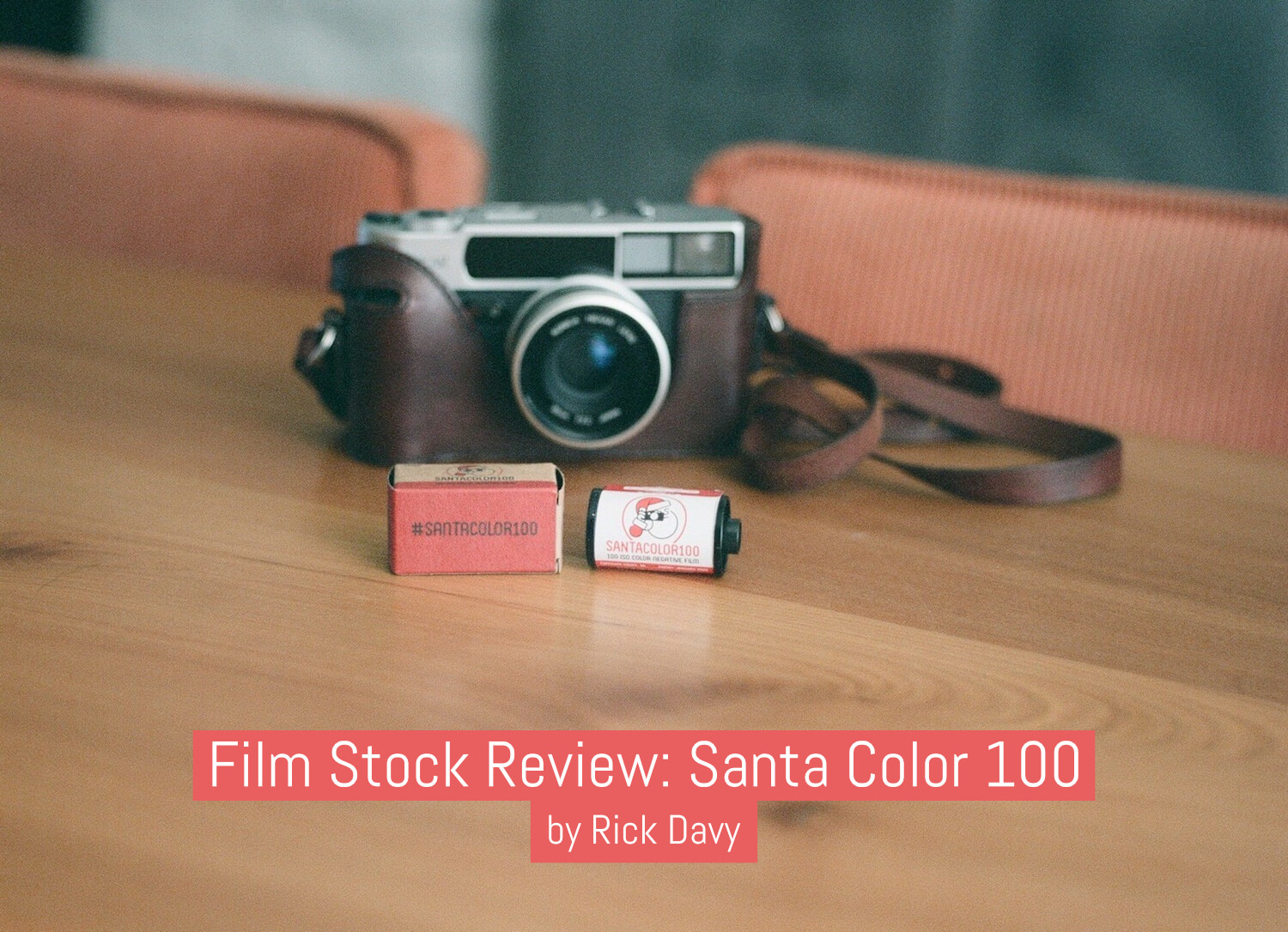
My Konica Hexar AF, (my go to 35mm camera) as the choice of gear for this test roll. It is an utterly superb little unit which I replaced my M6 with. I guess there will be those of you who might question my sanity but the M6 didn’t really deliver for me long-term and I really struggled with that Leica rangefinder element. Don’t get me wrong here, it’s an ace camera but I’m so much happier with the Konica. It does what is says on the tin and more, and I love shooting with it.
Enough about the background so let’s go onto what I found when I shot it (examples, of course enclosed) Firstly, the negatives. I’ve never seen anything quite like them, they were pink! Yes, pink. Crazy, but I can now see where the red element finds itself. So, I like to find a series of different colours to see how the new stock develops them with any new colour stock I shoot. Streetart does tend to offer a wide range of colour and I found that Santa stood up well to a varied colour palette — see the images at the top of this article. I also picked some roses, and the colour and tones from that shot matched well, I thought:

I then further moved onto skin tones and that’s when I began to see slight reddish tones with a hint of Fuji greens in there too. Remember what the guys said earlier about the reds and greens!
The following additional frames relate to a project I’ve been working on for the past few years: adayinthelifeofa.co.uk. On this occasion, it was “a day in the life of a violin maker”. Great content to shoot and a great addition to the project — thank you, Gary.


All in all, I’m super happy with how they all turned out and I will certainly be using this stock in the future
Oh yes, my final question to the guys at Santa was why Santa? and the answer to that was simple, the team is based out of Rovaniemi in Finland, Santaland to you and me.
Thanks for reading,
~ Rick
Share your knowledge, story or project
The transfer of knowledge across the film photography community is the heart of EMULSIVE. You can add your support by contributing your thoughts, work, experiences and ideas to inspire the hundreds of thousands of people who read these pages each month. Check out the submission guide here.
If you like what you’re reading you can also help this passion project by heading over to the EMULSIVE Patreon page and contributing as little as a dollar a month. There’s also print and apparel over at Society 6, currently showcasing over two dozen t-shirt designs and over a dozen unique photographs available for purchase.


One response to “Film stock review: Santa Color 100”
Renders a bit like Reala – great!