Creating a print is much more than simply setting up an enlarger, negative and some paper. The perfect print requires thought and effort from pre-visualisation through to the final print, with iterations at each and every point of the journey. While for some prints, the main choices might be as simple as how dark or light to make the print, or what contrast level to print it at, other prints require a little more finagling. I’ve put this article together to chart the journey of a single print from the initial exposure of the film to the final print. I hope you find it useful!
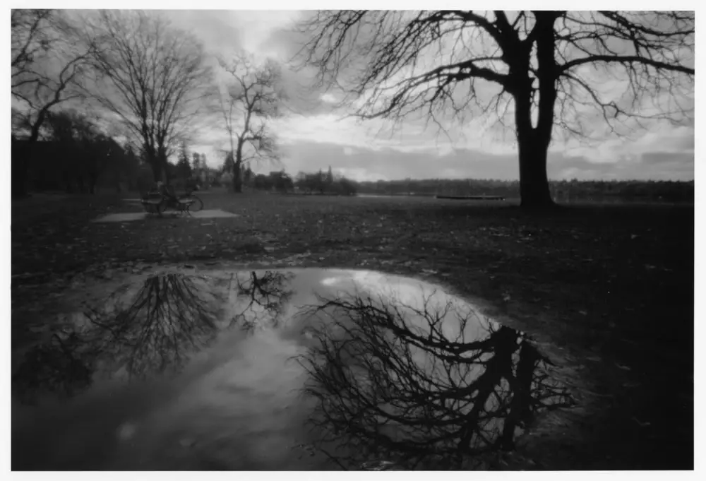
Let’s start at the beginning: my original negative was shot on JCH Streetpan 400 in a terraPin 6×9 pinhole camera using the Tri-X Plus-X 125 reciprocity failure curve in Pinhole Assist. I made the image at Greenlake Park and is the type of scene that I hunt for when shooting landscape pinholes – moody skies balanced with water elements.
Unless I have a lot of confidence in a negative, as viewed on the light table, I start with making a contact sheet from the roll; it generally helps me decide which negatives that I want to start with when printing and is a good reference for later.
Many printers make their contact sheets using a low-grade filter – around grade 1 – so that they can see all the details available to them in a negative. Because many pinhole photographs tend to be low contrast, and I often find the tones to be disconcertingly muddy, I make my pinhole contact sheets using a grade 2 filter.

Since the contact was promising, I jumped right to a straight print with a grade 2 filter.

Oh no…
This image didn’t work for me – there aren’t many mid-tones to balance out the image and the sky is blown out. I had tried some shorter times, but the grass became merely a muddy grey. The overall image sinks from its heaviness.
In order to recover some highlights or even a decent mid tone, I tried seeing what printing with a grade 0 filter would get me:

It was getting there but wasn’t great. I switched to the lowest grade, G00, which normally just emphasizes the highlights. First I did a test strip – the negative is on the thin side, so even with the enlarging lens at f/16, a few seconds make a difference.

With the test strip done, next, I tried some split filtering tests* – I did the base print at grade 00 and then added a short time with a grade 5 filter. Grade 5 impacts the dark tones and I often use it with pinhole negatives, as the added contrast imparts an illusion of sharpness, without diminishing the otherworldly look that pinhole is known for.
* Something sticky got on the test sheets, but I didn’t crop the scan for comparison purposes. It happens to us all.
Here are the results (click the thumbnails below to open them in fullscreen):


At this point, I decided to go with multiples of 5 seconds. I was still not happy with how the sky was printing and additional burning probably wouldn’t have helped.
I discussed this image on Twitter, and Lilly Schwartz suggested a pre-flash. As part of a separate discussion, I found out that surveillance films are difficult to print. I have no idea what a surveillance film is, but note taken, I’ll probably be avoiding the stuff in the future.
Regarding the pre-flash; here’s a neat trick for pre-flashing without taking your negative out of the enlarger. Open up the lens to its highest setting and pop the grade 00 filter into the filter holder. Hold a diffusing material under the lens during exposure – wax paper or a bit of glassine works well. I used a 1-second pre-flash for these prints. I still screw up sometimes and forget to dial the lens back down to the printing aperture, but it’s better than taking the negative in and out.
Here’s the print the discussion and subsequent testing yielded:

Compared to my previous tests, the pre-flash adds enough body to the clouds that the image has a better balance. At this point, I tried a full print on RC paper.

I let the print sit on my mantel for a few weeks. Part of the time it was shoved behind a frame and some knick-knacks. I developed quite a bit of antagonism towards this negative, but I was also not about to let it win!
Eventually, I then pushed ahead to create my final version on fiber paper. It still had too much heaviness that overwhelmed the ethereal elements – I needed to dodge the left side and a bit of the puddle on the lower right during the grade 5 sequence.
The times that I was using were too short to do this gracefully, so I stopped the lens down to f/22 and doubled my times.

Now, to be honest, this print still bugs me.
If I were to make another go around, I might try cropping a bit off the top and right side. The reflection is what was visually important to me when I made the image, and I think there is something about those two edges that is taking away from the reflection.
On the other hand, it’s the kind of image that shouldn’t feel comfortable to the viewer. So I’d need to compare both versions and decide which look portrays what I want the photograph to say.
While I was working on this negative, I was reminded as to why I don’t experiment with film stocks very often. My goal when photographing black and white film is to make a print; and years of printing, mostly using a single film stock, have refined a particular look that I want my prints to have. It’s so second nature that I don’t really think about it when I’m in the darkroom.
My standard film stock typically yields a lot of mid tones; I am so used to knowing what to expect, I can pop the blacks practically by formula while printing. Changing film stocks, without knowing how the new film will print, messes a lot with my expectations of what my prints should look like.
Of course, that’s also why it’s good to have a range of tools in your printing skill set; why it’s good to not be afraid of cropping, split filtering, or pre-flashing.
Sometimes you don’t get what you expect, or you make a mistake with the film. Sometimes, once you start working with a negative, you see a different interpretation to pursue.
To me, that’s what makes darkroom printing really special.
Thanks for reading,
~ Monika
Share your knowledge, story or project
The transfer of knowledge across the film photography community is the heart of EMULSIVE. You can add your support by contributing your thoughts, work, experiences and ideas to inspire the hundreds of thousands of people who read these pages each month. Check out the submission guide here.
If you like what you’re reading you can also help this passion project by heading over to the EMULSIVE Patreon page and contributing as little as a dollar a month. There’s also print and apparel over at Society 6, currently showcasing over two dozen t-shirt designs and over a dozen unique photographs available for purchase.


11 responses to “Silver craft: creating a fine print, from contact sheet to fiber”
Very very good! Thanks!
Thanks for sharing your thoughts and your story! That sounds very stressful.
Thanks for sharing your thoughts and processes, Monika. Very much enjoyed reading it.
Very interesting to learn about your process and the tip about pre-flash is handy. Having spent many years printing for other photographers, It is very common to make a good contact print, and then spend more time than you want to trying to make a large print that has the same feel as the contact. Clients often choose the frame based on the contact and expect a print that looks the same, even if you can make a much more interesting print for them.
Nice article, Monika! Re surveillance film: that is film that is used in surveillance cameras such as security cameras and speed cameras.
Nice article. I could really identify with your machinations! What film stock do you usually use for b&w?
Great article @DrMarsRover. Very informative.
Great article Monika!
Great to read about your process here @DrMarsRover !
@DrMarsRover @ILFORDPhoto @Jpncamerahunter Awesome Monika
It useful to read about a print where the process wasn’t straight forward. Thank you for sharing.
I especially like you advice on how to preflash without removing the negative.