Last year, while browsing in my excellent local art supply store, I noticed the rack of Solarfast dyes from Jacquard. It was there with their cyanotype supplies and I was fascinated to learn that it is a photosensitive dye that acts like cyanotype sensitizer but is available in a wide variety of colors.

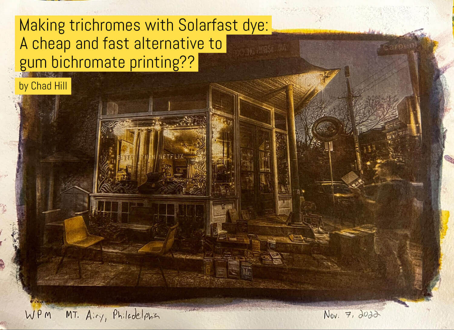
Above: My best print, to date. The WPM Typewriter Store, Mt Airy, Philadelphia. CMYK Solarfast print, made from digital negatives generated from a series of cell phone photos.
I had just been reading about Gum Bichromate printing, but had been intimidated by the process, so it occurred to me that Solarfast dye would be a simpler way to make color prints from the black and white trichrome images I had recently started playing with, following guides like this. I bought some bottles and set out to try.

Above: CMYK print from an artificially colored black and white shot I took many years ago in CA.
I assumed that if it was possible to make color prints using Solarfast, people must already be doing it. So I started Googling, looking for a ready-made guide… And was shocked to discover almost nothing. Twitter searches turn up a hit or two showing tantalizing examples that it can work, and the Jacquard instructions give some brief tips about making CMYK prints, but there isn’t much else. Maybe my googling skills need work, but most folks seem to use solar fast for one color printing on fabric, and there just isn’t much info out there on using this for multi-layer color printmaking.
Here’s what I cover in this article in case you want to jump ahead!
Table of contents
In the absence of a guide, be your own
Undeterred by the lack of a clear guide, I thought: this will be easy! I made some color separation negatives in photoshop, printed them on my laser printer, and started taking them out in the sun to expose them. On my first try or two, it sort of worked. But only sort of. So I tried again. And again. Over the course of many months of on-and-off-but-mostly-off experimenting, I slowly improved with the process. I’d try to make a print, it would fail for one reason or another, and I’d put it aside for a while, until eventually trying again.

Above: Joan of Arc (1890) by Emmanuel Frémiet, Fairmount, Philadelphia. CMY print from a cell phone shot taken in 2011.
One thing I have definitely realized since I got back into doing more analogue photography again, since the pandemic began: I enjoy the photography and image making process more than the outcome. I like messing around trying to get something to work, or learning how to make images in a new way, and, once I’ve learned, rather than concentrate on honing, expanding, refining, and producing a body of work, I lose interest and move on to something else! But this process always seemed so close to working, without actually being right, that it has really kept my attention for quite a while now!
Ways to go wrong or at least make it harder…
This document began as a way to write up notes to myself to remember what I had done and what I need to remember if I go away from this process and come back. But I also hoped that it might help someone else try this method of printmaking with less trial and error! So before I get to my current workflow, here are some of the problems I had or continue to have, that may help you avoid learning some of these lessons via your own failures! Though some of this is probably extremely obvious to people with more experience with similar processes:
- Solarfast is very similar to cyanotype, but…
It is hard to rely on the sun for exposures for a variety of reasons. Not least because most of my time to work on photography projects is at night, when there is no sunlight! But also, it is hard for multicolor prints because it is time consuming and annoying to constantly go in and out to bring out and take in each new layer. And because of clouds and changing conditions, it is hard to ensure equal and consistent exposure between layers! For this reason, it is best to use reliable, repeatable, and consistent artificial UV light for the exposures. - Have enough artificial light…
I started trying to use a single cheap UV LED bulb from Amazon, in a drop-light bulb holder with a reflector, Edward Weston style. While this single bulb put out some UV light, it was not powerful enough to expose each layer very quickly. A set of 3-4 layers took several hours, but more importantly thet Solarfast would dry out during exposure. Solarfast should be exposed when wet, and so long exposures are more likely to be inconsistent and hard to wash off! In the end, I built a simple/cheap UV exposure box, with LED strips, using this guide! It has made exposures much faster (see below). - Don’t use too much Solarfast!…
You need to coat enough dye to cover the area where the image will be, for each layer, but too much will cause the dye to get stuck to the transparency/negative and then pull away and cause blotches! The Solarfast guide mentions this, but it is still easy to get carried away and use too much. The upside is that you generally dont need much dye to coat up to an 8×10 area. Although it takes a lot of dye to coat fabric, one small bottle can last quite a while for printmaking. - Whoops… Don’t use too LITTLE Solarfast!…
I’ve also gone too far in the other direction. if you are TOO aggressive at removing excess dye, there won’t be enough and it will result in lower contrast/less deep blacks. - Pre-wet the paper…
Watercolor paper shrinks, to some extent, when it gets wet. This can create problems for two reasons: 1st if you make the first layer while dry, and then the image shrinks in the wash after the 1st coat, the second layer won’t line up! 2nd the dye adds moisture to the paper, and if you add dye to dry watercolor paper, it will start to shrink in weird ways and won’t sit flat against the negative resulting in unsharp prints! I do all the coats with the paper wet, but wiped down, to remove excess moisture, before applying each new layer of dye. - Use the right paper…
I have been experimenting with different watercolor papers. I have a bunch of Fluid Cold Press watercolor paper handy, because it has been my go-to for emulsion transfers, has a nice texture, and has mostly worked well. Most of the images in this article are printed on that. But I’ve also tried a little bit of smoother and cheaper hot-press studio paper from Fabriano, some cheaper and thinner Strathmore 9×12 watercolor paper and some even thinner Strathmore “Printmaking” paper, which was definitely too thin. The key is that it needs to be heavy enough to not fall apart in repeated immersion in water, and probably the less texture the better for image sharpness since it will sit better against the negative!. At some point I will also start experimenting with ‘sizing’ the paper to try to fight the color backstaining problem I have had (see below), but I havent tried that yet! - Get the negatives right…
To make a tricolor print you need 3-4 transparent negatives to print Cyan, Magenta,and Yellow, or Cyan, Magenta, Yellow, and blac,K, (CMYK) layers. Like Gum Bichromate prints, there is a lot of room for different workflows to make color separation negatives. I’ll describe, briefly, the process I’m using below, but I’m trying to keep it as simple as possible. It can get pretty complicated, doing things like applying custom curves for each color. But I have tried to avoid getting too far into the weeds with separate color layer modifications. After fixing a lot of the problems I was having coating and exposing the Solarfast, I like the results I get with a very basic color separation workflow with only minor adjustments of total exposure time for each color. Solarfast also doesn’t quite come in exact matches for Cyan, Magenta, and Yellow. Jacquard recommends using Blue, Red, Golden Yellow, and Black but Ive had good luck (and think a better match for CMYK, with “Teal”, “Violet”, “Golden Yellow”, and Black.

Above: Some of the trial-and-error discards from slowly learning the process and making many mistakes
My current workflow
This is what has been working for me after much testing. There is room for improvement here, but it’s where I am at now. I hope other people might work on this and help improve the process, because I think this is a cool low-tech, low-cost printmaking method with tons of neat potential.
Supplies:
- Watercolor paper
- Solarfast dyes (Golden Yellow, Violet, and Teal)
- Foam brush
- Tray
- Hot water
- Solar Fast Wash (may be able to substitute something like dish soap!)
- A UV light source (the sun if nothing else is available!)
- Transparency paper and a printer
- A contact printing frame or something improvised to hold a negative to a sensitized paper
Step 0: BEFORE making a real print
you need to establish at least an approximate exposure time for your UV source. You can use a step wedge and some small test pieces of coated paper. Jacquard provides a guide for this, here. I found this helpful for getting in the ballpark and then tuned my times better by making actual prints.

Above: One of my first “successful” prints: a CMY trichrome print made from 3 scanned black and white Instax trichrome images (R,G,B filtered), made as part of the Shitty Camera Challenge #instantregret competition
Step 1: Create a digital negative
As I said, there IS room here to do lots of different things here, though I am trying to keep it simple. Although an initial goal was to make prints directly from b+w trichrome images, at the moment, I’m working primarily from color digital images to keep it simple.
My best results have been with images that are contrasty and have a range of colors. I bring an image into photoshop, scale it to the print size I want (often ~8×10, 3×4, or 4×4). Invert the image to a negative, convert the image to CMYK color space if it is RGB, then convert each color channel (C,M,Y,K) to a separate layer (Go to the Channels tab, turn everything off except the channel you want, select that channel, hit ctr-a, then ctr-c, create a new layer, and ctrl-v to paste).
Repeat the above for each channel. I add the Letters (C, M, Y and K) above or beside each color layer, so it is easy to figure out which is which later! Then I print the 3 or 4 negatives on a transparency sheet using my laser printer. You can also separate the 4 channels to separate FILES by clicking on the “3 bars” in the upper right corner of the channels tab and choosing “split channels”, but I generally like to keep all the separate negatives in one file as separate layers!
Pro-tip: For an easier start, add registration marks. For a while, I was adding “registration marks” to try to make it easier to make sure you line each layer up correctly with the previous layer. You can add “x”s or “+”s outside the image to serve this purpose. As long as your dye is spread widely enough to include the registration marks, you will be able to see them in the previous layer and use them to line up the next negative. But, ultimately, I find it more of a hassle to add the registration marks than it is helpful to have them. I can (usually) line up each layer by looking at the edges of the previous exposure and lining the edges of the negative up with those. Alternatively, you can line all your negatives up carefully beforehand, then push a thumb tack through all of them into the paper underneath. Then, when you go to print each individual layer, line up the holes of each negative with the holes in the paper, using your thumb tacks!
For printing the negatives, I suspect it would be better to use an inkjet printer, but I don’t have one! I am sometimes using the special, and pricier, transparency sheets that Jacquard sells, but I’ve had just as good results getting prints from cheap transparency sheets from amazon. N.B. Jacquard recommends “doubling up” negatives to get enough density to make good prints, because the dark regions of home printers are often not fully opaque, but I’ve mostly found I get “decent” results with my laser printer and cheap sheets as long as I manage the dye quantity and exposure times.
Step 2: Make the first exposure
People usually recommend printing lighter to darker layers, for similar processes, so I have generally printed in this order: Y, M, C, K. As mentioned above I am experimenting with a mix of papers, but, most commonly, have used pads of Fluid Cold Press watercolor paper. I pre-wet each sheet for a few minutes in hot water, then lay it on a flat surface, and squeegee it off with a paper towel. I then pour a dollop of Golden Yellow dye onto the center of the paper and spread it with a cheap broad foam brush. I just eyeball the size of the area to cover with dye because I LIKE the sort of haphazard edges this creates, but you could measure the area and mark it with pencil lines for a cleaner look. I make sure the dye is spread evenly by making long strokes in both directions. Finally, once the dye is reasonably well spread, I squeeze the excess in the brush into a paper towel, then use the now-dry brush to wipe up excess dye on the surface. I try to keep wiping, and then dabbing the brush on the paper towel, until the surface of the paper is clearly damp, but no liquid is visible pooling on top of the surface.

Above: Detail of my DIY UV setup and budget “contact print” frame. Below: An exposure in progress。

Place the negative against the sensitized paper, hold it down with some kind of glass, and place it under your UV source. The negative must be held down, flat. The ideal way to do this is to use a contact printing frame, where the negative and paper are “squished together” but a hinged back allows you to check the progress of the exposure without shifting the negative. But proper contact printing frames are expensive, and, while I intend to build a better DIY version at some point, I’m currently using an improvised setup: The 8×10 glass from a cheap frame clipped down to a clipboard with bulldog clips!
Pro-tip: Ideally, you would print your image backwards on the transparency sheets so that you can place the negative “print side” down, against the sensitized paper, and the image will be correctly reversed. But, at least for the cheap mylar I’ve used, the negatives last longer (for multiple prints) if the printed surface does NOT come into contact with the wet paper, and so I do not reverse my images before printing and there is probably some slight loss of sharpness because the printed side of the negative is not in direct contact with the paper, but is instead separated by the thickness of the mylar!
Expose the yellow layer for the time you calculated above. When the exposure is done, remove the paper, and wash it. The yellow layer is the most problematic layer for washing because the yellow Solarfast dye tends to stain the paper even where it has NOT been exposed to light. The result is that very light/white areas can tend to take on a yellow color cast. To fight this, Jacquard recommends using their “solar fast wash” product combined with hot water. I use a capful of the wash in a tray of the hottest water available from my tap and wash the print for a few minutes until the water stops turning yellow. But an alternative solution would probably be “sizing” the paper, to make it less amenable to backstaining. I have yet to really explore this option, but will be now that I have better control over some other areas of the process!

Below: The Big Blue Marble Bookstore at Golden Hour, 2022
Step 3: Expose the next 2-3 layers
When the wash is done for the first layer, you can immediately move to coating and exposing the next layers. I wipe the paper down with a dry cloth, so there is no wash water sitting on the surface, but the paper is still wet! I lay it back down on a work surface, pour a dollop of the next color, and continue to coat it as I did for yellow and then move it back to my UV source.
The exposure times will not be the same for each layer. The main way I am controlling color balance is by varying exposure times between color layers. Jacquard lists a basic exposure table for sunlight here, and an important takeaway is that exposure times for “teal” is longer than for “golden yellow”. This matches my experience. I generally expose the yellow layer 20-30% shorter than the teal layer, And I usually match the Violet layer to the Teal layer. When I add a final “black” layer, I have had success exposing the black dye for about the same as the yellow layer. But it is crucial to get that exposure right to get the shadows as black as possible without making the whole image too dark! Ive recently realized that, like gum bichromate printing, you can double up layers to improve the final print. On the print above, of the Big Blue Marble Book Store, my Violet layer came out significantly underexposed, so after the black layer, I added another layer of violet dye and increased the exposure time. This compensated for the underexposed layer quite nicely.

Above: A CMYK print from a colorized black and white 6×9 image taken near the town of Ghor es-Safi, Jordan in 2013.
The washing is the same for the other layers as it was for the yellow. And then, at the end, after all the layers have been exposed and washed, the paper is allowed to dry completely.
There are a lot of steps, but, with a bright enough UV source, the whole process doesnt have to take that long. I am now able to make a print, start to finish, including generating and printing the negatives, in about an hour.
Conclusion
This is a really cool, affordable, and non-toxic way to make color prints using a process that is relatively accessible and replicable. My results so far continue to have significant room for improvement, but I’m really excited that my prints are finally starting to look “good”, and I am hoping others might find this guide useful and will enjoy making these, and hopefully improving on my process!
~ Chad
Share your knowledge, story or project
The transfer of knowledge across the film photography community is the heart of EMULSIVE. You can add your support by contributing your thoughts, work, experiences and ideas to inspire the hundreds of thousands of people who read these pages each month. Check out the submission guide here.
If you like what you’re reading you can also help this passion project by heading over to the EMULSIVE Patreon page and contributing as little as a dollar a month. There’s also print and apparel over at Society 6, currently showcasing over two dozen t-shirt designs and over a dozen unique photographs available for purchase.


10 responses to “Making trichromes with Solarfast dye: A cheap and fast alternative to gum bichromate printing??”
Thanks for the article.
I try it !
But After many try i have some presisting problèmes.
Witch wavelight for your UV lamp? 365 or 400?
Thé exposure Time is very long about 20min and in the end the color are pale!
Thanks anyway again .
Benoît
Great alternative to traditional gum printing! Thanks so much for posting. I stopped gum printing 2 years ago because of the risks but now will try again with the Solarfast products.
2 questions: Have you tried reversing the print order from YMC to CMY? Have you tried any sizing to prevent staining yet?
Fantastic work! Curious to try this process. Also, nice to see a couple of Philly favorites!
I’m in the two-color stage, with cyanotype you can make yellow and blue.
funny to read this article as I had the same problem of finding information online about doing gum print but with solarfast. took ne some trial and errors as well before i got a good print!
I’m astonished by your results, well done! Do you have any idea how long such prints might last? I do sell some prints, and if I were to use this, I just wondered if the prints would have a short lifespan.
Thank you for this careful, clear how-to. I have done a lot of tri-color gum, and gum-over-cyanotype, but am really interested in this, being concerned about the toxicity of the dichromates… I’ve been hesitant to try because of the time sink involved in figuring out the differences (wet paper, upside-down negative, which Jaquard colors to use for the cmyk, etc.), I think you have helped me get over that!
Fabulous work. Always enjoy reading about the antics that others get up to on this site! Inspirational!
So impressed at some of the things other people get up to here on EMULSIVE! Inspiring read, thank you.
Amazing, Chad! Loving the results and the sheer mad genius of it!