I believe that we don’t give enough consideration to photographing flowers in black and white. Last year I ventured into the garden with my Minolta XD-11 and ILFORD’s HP5 PLUS. Recently, HP5 has become my ‘go-to’ 35 mm B&W film after my experiences of the past 2 years. I was also pushed by the Frugal Film Project to shoot HP5 for three months in 2020. That solidified the relationship. So, I photographed my Valentine’s Flowers on HP5. And a month later, explored ‘My Inner Monet’ with HP5, by photographing the dried flowers. I’ve even received some artistic notice for my B&W flowers. It’s obvious that HP5 has become one of my favorite films. So when my Birthday Flowers arrived, my X-700 and HP5 were waiting…
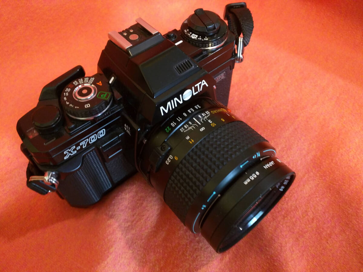
The Minolta X-700 is an old friend of mine. It was my geological field studies camera since the late 1980’s. I currently have three fully functional models. I still keep an X-700 by my side when traveling. Typically I use it for ‘on the road’ color imaging, but with the disappearance of many of my favorite color films, I’ve transitioned the X-700 to more B&W. The lens I used is a Minolta MD f/3.5 50 mm Macro.

These flowers were from a bouquet sent to me by my eldest brother and his wife for my 60th Birthday. No big celebration because of COVID, but lovely flowers and lovely images (which make lovely memories). Enough said for the moment, let’s jump in.

The flowers were a mixture of Lilies, Roses and another flower that I I had to look up called Alstroemeria, shown below:


I was especially loved the Lilies and the way they wrapped around the Roses:


I’ve found the B&W images of these flowers much more appealing than the color versions. Let me know if you agree.
OK, I know this is 5-Frames, but here at the end I’m giving you a Bonus:

~ Kathleen
Submit your 5 Frames… today
Get your own 5 Frames featured by submitting your article using this form or by sending an email via the contact link at the top of the page.
Share your knowledge, story or project
The transfer of knowledge across the film photography community is the heart of EMULSIVE. You can add your support by contributing your thoughts, work, experiences and ideas to inspire the hundreds of thousands of people who read these pages each month. Check out the submission guide here.
If you like what you’re reading you can also help this passion project by heading over to the EMULSIVE Patreon page and contributing as little as a dollar a month. There’s also print and apparel over at Society 6, currently showcasing over two dozen t-shirt designs and over a dozen unique photographs available for purchase.


4 responses to “5 Frames (+1)… Of beautiful B&W flowers on ILFORD HP5 PLUS (35mm Format / EI 400 / Minolta X-700 + MD 50mm f/3.5 Macro Lens)”
Did you use any colour contrast filters?
Beautiful shots Kathleen. So good to hear from you. We flitted around together when 52 rolls was a “thing”!
Beautiful flower photos, which are truly expressive in b&w. I always smile to myself whenever I see flower photos because of a discussion I had with a work colleague some years ago. We were talking about photography being my hobby and she said “you must take the most beautiful flower photos.” I thought for a moment and said “I’m not sure that I’ve ever taken a picture of a flower. But give me an old dilapidated building to photograph and I’m in seventh heaven.” She just shook her head and walked away. That’s what is wonderful about photography – everyone can express themselves in their own way.
Kate, I loved the b&w roses and lilies, and that was surprising at first. But then the color seems to distract my eye from the spatial relationships between the individual powers — very attractive– and the b&w makes the depth and distance clearer. Really love it!