Welcome to the Community Critique Project: a new concept for providing peer-driven photographic critique through a platform of honest, open and measured discussion. In short, a photographic critiquing platform for the film photography community, by the film photography community.
This first article provides an extended background of the concept, outline of the format and the results of the first critique.
Let’s jump in.
Community critique: background
The web has given us global connectivity with our peers but seem to have paid for it by losing the art of discussion.
It’s no secret that the internet no longer feels like a place for rational and reasonable discussion. Comment sections across the web are filled with barbs, put-downs, flame wars and let’s be honest, plain and simple bullsh*t. What may initially start as an avid debate all too often crumbles into personal attack, or threads filled with bile and bitter comments. You don’t have to take my word for it and sadly, you don’t have to look too far.
All too often it feels like there’s no longer room for agreeing to disagree or respecting someones (differing) opinion. Anything we don’t agree with is labelled as “fake news”, patently incorrect, propaganda, or something to rile against.
Social networks offered some hope in the beginning, although that has sadly been dashed – in public at least. So, where have people gone to for reasoned debate, discussion and critique? Into closed groups and communities for the most part, much like the bulletin boards and newsgroups at the dawn of the web.
I believe it’s time to try and change that, however small and insignificant that attempt may be. I’ll start by drawing a couple of lines in the sand:
Development
The Community Critique Project has been developed over the past several months, tying together threads of conversation between myself and several members of the film photography community. The foundation of all of this work has been a single thought:
There needs to be a renewed appreciation and understanding of what it means to have our work critiqued, as well as how we should conduct ourselves when we are asked to critique the work of others.
Don’t mistake this as an attempt to create safe spaces where positivity and nothing else reigns, it’s about creating a platform where both parties understand their responsibilities and undertake them with thought, respect and appropriate temperament. Which leads me to…
The importance of effective critique
…cannot be understated.
Effectively delivered technique can change the course of a project, or photograph. It can lead the recipient to reconsider their motives and create work at a level which they may not have thought possible before. In turn, the act of contemplating delivery of critique may help that individual explore areas that may have been forgotten and enhance their own creative output.
In addition, by understanding critique from both sides of the table, we can help build better communities by using lessons learned through direct interaction, or even through the process of reading an effective exchange (more of which you can see below).
Realization and execution
Each Community Critique “case” is reviewed by a panel of three photographers, and the project being critiqued may be a single image, or collection. Each case is comprized of four main steps:
Step 1: Subject selection
Subjects are selected on a case by case basis, and applications are open to everyone regardless of experience, scope or level of development.
Step 2: Panel Selection
It was my aim with this initial case to ensure that I selected a panel of critics who would bring with them relevant experience, differing photographic styles and opinions, as well as an appropriate temperament. It was also important to bring together a panel that would complement the work of the subject. The “temperament” aspect may seem a little strange at first but is something I believe to be critical to the long term success of the project.
Step 3: Oversight
Oversight to the entire process, from subject selection, matching the panel to the subject, creating supporting documentation and ensuring a blind review is currently performed by me. During the critique process I provided the panel with background, expectations and ultimately access to the statement and images you see above. It should be noted that the images originally submitted included Rob’s raw, unedited film scans. They have not been shared here for obvious reasons. I will continue to provide oversight for future cases but welcome any support the community may wish to offer.
Step 4: Feedback
Initial review, feedback and subsequent rounds of feedback, review and discussion may take several weeks. As a result, Community Critique is not suitable for projects with close release deadlines. The first review you see below contains three rounds of feedback, presented in a conversational style.
Blind critique
At the time of publishing, the subject of this case (Robert J Davie), has not been made aware of the identities of the panel members. I decided to keep the process blind in order to ensure that feedback was not misinterpreted, or given unfair weight.
It’s a simple observable fact that we are often less analytical of direct feedback or suggestions from people we admire or whose opinion we respect. Keeping the panel blind minimized the possibility of gender, racial or socio-economic bias.
As you will see below, details about the panel members have been provided but their critique remains anonymous for the moment.
Format outline
Each Community Critique case will be presented in the following format:
- Project overview
- Technical details
- Artist’s statement, including specific critique requests
- Keystone image description
- Panel critique (panellist-by-panellist)
- Artist response to critique
- Critique feedback (by artist)
- Artist’s closing thoughts
Now you know what to expect, I’d like to welcome you to read the results of the first Community Critique case.
S T E I N: Project overview
Technical information
| Critique type: | Collection |
| Photographer: | Robert J Davie |
| Location: | United Kingdom |
| Project name: | S T E I N – a photography zine by Robert J Davie |
| Media used: | Ilford FP4+, EI 125, 120 format shot as 6×7 |
| Paper(s) used: | Tesco glossy inkjet paper |
| Camera(s) used: | Mamiya RB67, 90mm lens |
Artist’s statement
S T E I N is a collection of photographs taken by me with my Mamiya RB67 Pro-S, a 90mm lens and ILFORD FP4+ medium format film. The photographs were all taken in or of York Minster, a colossal cathedral in the ancient city of York, England.
The intent behind the series is to put together a ‘zine. The order of photographs has not been finalized as yet, so the photographs are likely to move from their current designation.
The running theme of the collection is “stone” (stein is German for stone); I spent a lot of my childhood living in Germany and the language is very evocative of solid, permanent things.
Another theme is detail. We spend a lot of time in awe of the majestic beauty of buildings like the minster and I want to showcase the details that make it up.
There are close-ups of marble from tombs, of the base of pillars etc. There would be no glory without the detail. This reflects our own existence; we see each other as whole complete people but in reality we are made up of details ourselves, from our experiences forming our attitudes and personality to the genes that decide how we look and what colour hair we have, it’s all decided on the micro level but experienced on the macro level.
That is my aim with this collection: to show the micro to enhance the appreciation of the macro, and perhaps trigger some thought about our own composition.
The camera was chosen because I love the detail and experience. The negatives are so great to work with in Adobe Lightroom. I love working with the RB as I mentioned in my review, it’s almost therapeutic. The film was chosen for its exposure latitude in what would be quite dark scenes, whilst maintaining an attractive but very fine grain.
Ideas regarding the order of the shots would be very welcome, I am struggling to get a feeling of the flow (it’s the first time I have attempted this), and also how well they sit as a collection. Individual shot feedback is also very much welcomed.
NOTE: Click on any image below to have it open full-size.


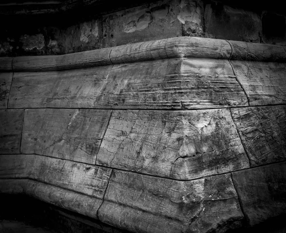
Project Keystone
Photo 2 in my collection is the keystone. It is a shot of the (outside) corner of one of the towers of the minster. I was drawn to the scene because of the phenomenal detail on the stone. These blocks have been there for at least 500 years and have a huge amount of character.
The keystone image shows the workmanship at the base of the structure upon which all else is built. This ties in perfectly to what I am trying to get across about how we are built upon our experiences and genetics of our forebears. I would like specific feedback on this shot, please.


My intention with this shot is to show the detail of the stone as well as something about its place in the overall scheme. I wanted to have the corner looming out at the viewer bringing attention to the crack on the centre cornerstone. From there the viewer’s eye can travel along and around the various lines and blemishes, not unlike reading a palm.
In its online form the photograph is not quite as vignetted as I wanted. The printed version is much darker around the edges and has a better contrast to it which emphasizes the cracks etc. even more, which is good.
Any and all constructive commentary and critique is very much welcomed. The same goes for the whole collection.
Panel critique and oversight
When it became clear that Rob was going to be the guinea pig for this first case, my mind immediately landed on the three photographers you see below. I have had the pleasure of getting to know each of them over the past couple of years and readers with active Twitter accounts, should be well aware of them, too. They are Monika, Craig Pindell and Erik Gould.
Following below you will find each panelist’s critique. For reasons already explained, each panelist’s critique has been anonymized. I’d like you to go through the same blind process Rob did.
Specific areas of critique that Rob requested clarification on have been marked with links in the text you see below. You can jump to Rob’s comments by clicking on each “#RD XX” link should you wish.
Panelist 01 critique
I very much appreciate your feeling for this camera and lens. And the parameters of the project are ambitious, but if you can make it all come together, it will be stunning. I can tell there has been lots of thought put into this. *RD01
The keystone image – I like the idea in your explanation, but I do not think this image is strong enough to accomplish your intent. I like how the corner line has been plumbed (made more vertical) and that has helped the image. For me, printing the upper and lower portions so dark, has hurt the image (I used to print this way myself, feeling it added mood and drama, but it really doesn’t). *RD02
I also feel this image would have been stronger if the base of the form were all included. The broken lines detract from the strong solid shape. There is a lot of information in the unedited image and that is a great thing! I think more contrast to increase the feeling of coarseness in the stone would help.
I think there is a great image waiting to be discovered in this negative. I would add that this image has a hand held look to it – almost that the camera was rotated on purpose? If that is not the case, I would suggest going forward it would be worthwhile taking another minute or two to check horizontal and vertical of the camera before making the exposure. *RD03
Artist response
RD 01: Could you perhaps give more feedback on the collection please? Why do you think it will be stunning and do you have any advice for the collection as a whole?
P1: If you look at the collection in a Contact Sheet style, you can see the compositions are all very similar, with mostly vertical or horizontal lines. The exception is image 8 that has some diagonal lines. Image one has a bit of a diagonal feel as well. For me this gives the overall collection a bit of a static feel, and if that was your goal, you have done your job. I can see that with this type of subject, solid and static could be the feeling you have when photographing.
For my eye, the images have too much contrast, overall. I like shadows to have detail, and highlights to have detail as well. To me that gives the full range of tones, but that is my personal taste and style, and may not suit your vision.
—
RD 02: Would you advise a slight reduction in the vignetting, or a more dramatic downplay?
P1: If I were printing these, I would explore lower contrast and a bit lighter printing, with less obvious vignetting. It seems that this would open up the subject more.
When I first saw Bruce Barnbaum’s Cathedral series, I was most struck by the light and open feel. I felt I could see more in the images than I ever could when looking at the same scene with my own eyes. One of photography’s greatest characteristics is that it reveals things we do not see ourselves.
When I just googled Bruce’s Cathedrals, I saw that he has printed them both light and dark. I prefer the lighter prints, but it is certainly personal preference, and you are the creator, so your preference is the ultimate choice.
P2: P1 makes a great point here. I’d say try it multiple ways and see how they sit together. It’s remarkable how different the atmosphere can be with small changes in value and contrast.
—
RD 03: Funny story – as I was taking this there was a drunk guy about 25 yards away shouting and harassing walkers-by. Because of this I did rush a bit I think and I completely get what you are saying.
P1: I have been in similar situations myself, and end up kicking myself later for not taking the extra time to make it right. Remember that when you put your work out to the public, there will be viewers that understand circumstances contribute to the outcome, and there will be as many, or more that will be critical that the image is not perfect.
I personally hope for perfection every time I make a photo, but try for my best, and fall short of that often. Sometimes I can make it better in the darkroom, but it is always best to get it right as you expose the film.In this situation, your best hope would be to have a bodyguard, I suppose, and I know that each successive time you are in this situation it gets easier.
All of that being said, safety is always more important than the perfect photo, and you should not put yourself in harms way to make an image.
Panelist 02 critique
This is a strong group of photographs, Robert. I’m glad to have the chance to talk about them.
I’m going to start at the start with your project description. I find it concise and nicely free of art world jargon. I often find it helpful, once I have a full statement to then craft a short one or two sentence summary statement from that, a type of an ‘elevator pitch’. This can be useful for marketing but beyond that can be a helpful guide as you structure the presentation and consider your audience. Which brings me to my first question, who do you see as the audience? *RD04
My feeling is that unless you intend to share this primarily with photographers you really don’t need to say much or anything about camera, lens etc. Or if you do, put that at the end, “a note about process…” sort of thing. It’s not about the camera, right? *RD05
If the audience is for example very local, like an antiquarian society who would know the cathedral very well, you would need little introduction or context, but they may perhaps desire an essay that walks them through the space in a familiar order. *RD06
If, instead the audience is a more general one made up of people who appreciate architecture, history and fine photographs thereof, you would have more flexibility with the layout but you may wish to provide more context. Context might be a bit of text, or it could be an image that shows the cathedral in a wider view.
The images all fit your theme of stone quite well with the exception of number 6, the organ keyboard. The wood grain throws it for me. I wonder if you may have edited this set too tightly, I would like to see more. *RD07
Depending on how you choose to lay things out you may wish to go back and and find a connective image or two, or go back and shoot something else specifically for that. Looking at the set I find I wish to see areas of stone that show human contact, worn down from touching or countless footsteps. The totally unfair example of this is the classic image below by Frederick Evans, “Sea of Steps” from 1903.

‘A Sea of Steps’, Wells Cathedral, Steps to Chapter House, 1903. Source: Christie’s
But that’s just my opinion. Thinking about options for layout and structure, the photo essay approach would be a virtual walk through the space, moving from outside to in, front to back etc. With something like that having a range of wide establishing shots mixed with medium distance views and details is very useful. I look for that variety of points of view in my contact sheets when I begin to structure an essay, but that’s just one approach. *RD08
As your theme involves detail, that opens up other ideas.One possibility is to unveil the idea slowly, using areas of light and dark, starting small and building to a point where you are hitting the viewer with a full on texture further in. Almost in the way one’s eyesight adjusts to low light when coming in from the bright outdoors.
A second approach would be to look at formal elements within individual pictures, the forms, values, textures and pair images based upon correspondence between them. In a magazine layout you’ll usually have images on facing pages, so finding pairs that work, that talk to each other is essential. Don’t be afraid to alter the size and shape of your images, the zine is a work to itself and doesn’t need to conform to prints made for exhibition.
My own curiosity wishes to see a view of this cathedral in the context of the town, and that might also be true for others, but it may not work and I think you’ve made a good case closing in and narrowing the focus.There’s a sense of mystery here and I think that is what you should build and expand upon. Leave some room to suggest the sound the place must have and perhaps what lies beyond. *RD09
I look forward to seeing what you do with it.
Artist response
RD 04: I am hopeful that the full collection will be something which holds interest for non-photographers. Antiquarians, visitors to the Minster who have more than pure sightseeing on their mind, perhaps even architects.
—
RD 05: I agree completely when you suggest I don’t need to say much about the camera/lens/film used. It is not my intention to have any technical detail in the finished product.
—
RD 06: Have you seen the idea of essays work well before? I had considered small pieces of writing for one or all of the photographs. My initial idea was poetry or prose that relates directly to the piece opposite, what do you think?
P2: I have seen them work, I think a choice piece of text can expand on the ideas you are presenting, create a mood or play off the image. My advice would be to be brief. I don’t think you wish to be explaining the pictures.
—
RD 07: Regarding the comment about tight editing, this collection represents probably about 75% of the photographs I have taken on film in the Minster. There are a lot on digital but I wanted this to be a film project. How many photographs would you expect to take in order to narrow it down to say 30 or so final selections?
P2: 3 or 4 times that. Depends on the subject, more for fast moving events, maybe less for architecture. It’s great to have choices with variations.
—
RD 08: Do you print contacts sheets, cut them out and physically move them around?
P2: Yes, and yes. Either that or small work prints.
—
RD 09: This is one of the most useful comments here and has immediately made some ideas pop into my head. Thank you.
P2: Great! I’ll shut up now!
Panelist 03 critique
This is a really wonderful idea for a project and I’m delighted that York Minster allows photography. While I have not been to this particular location, my family spent a some time visiting St. Paul’s cathedral and Winchester Cathedral in summer 2016. The stonework was beautiful and I can understand the visual and emotional desire to photograph it. *RD10
For the keystone image, I took the liberty of downloading the file and placing it on a simple background – first white, then light gray. Using white background is how I would normally look at a print for evaluation. *RD11
The contrast in the image works really well, emphasizing the texture of the stonework. My fingers can almost feel the cool and rough stone. The details in the image pop out nicely.
The image has a lot of visual weight. While I understand that this is part of your desired effect, there was also something not quite working for me. There is a heaviness, but also a sense of discomfort and unease; as if the stone was not sturdy but unbalanced and about to tip out of the frame. *RD12
Do you intend to keep all the images to 6×7? And do you have any objections to cropping? When I review prints, I have a handy pair of cropping “L’s” made of white matboard. Apparently I’m very dependent on these, as my next step was to create something similar in photo editing software. The nice things about the “croppers”, is the way that you can move them around and evaluate the effect. (Which is also why I went with a gray background, so I could better see what I was doing.) *RD13
This is what I came up with using my digital croppers. I took a smidge off the top, and a smidge off the bottom of the image:

[EMULSIVE: The image submitted by Rob is shown below for reference.]
At the top of the image, there is a light area of distressed stone; while it is interesting in of itself, I feel that it upsets the balance of the center stone and takes some away power from it.
On the bottom of the image, there is a dark area to the right of the corner that swoops toward the central stone corner; the relative size of the dark area creates a tiny bit too much movement and emptiness. Moving the croppers just slightly up the image steadies the corner rock, without making it too static.
The overall effect, for me at least, of these two minor adjustments is that the resulting image is very slightly more stable, without losing the beauty of the details. It is also slightly more rectangular, which is more visually pleasing with the lines in the image. *RD14
The variety of images presented is a good start and I would really like to see more. I hope that you will continue to work on this project and look forward to seeing the final collection.
Artist response
RD 10: You have given me an idea for an expanded collection, or possibly a series of collections!!!
—
RD 11: I really appreciate the info on your workflow. I have been using black but will try other options.
—
RD 12: Your point about “heaviness…discomfort and unease”, I think that this is one of the things I actually like about the print! I do enjoy dissonance but will have to consider whether it works in this context.; as if the stone was not –sturdy but unbalanced and about to tip out of the frame.
—
RD 13: I use Lightroom, which has a good crop and rotate function where you can see the whole picture, and the area that you are going to have after your edit. I need to use it more and experiment I think.
—
RD 14: Wow! what a difference that tiny change in crop makes to the image! The centre of balance has shifted perceptibly.
This worked really well and I understand where you are coming from. I am guessing that playing with the vignetting a little would help this too, being a little less heavy handed is something I am looking at, following Panelist 01’s suggestions.
All three of the panelists have made me think much more about framing and cropping than I did before. Thank you all.
Critique feedback
Receiving critique is only part of the process, and I felt that asking Rob to provide his own feedback on the comments he received would be valuable for both the panel and the project moving forward.
Artist on Panelist 01’s critique
The suggestion of more contrast and of slightly different framing for the keystone image is very welcome and interesting.
It is the one that I am coming back to the least, which mighty speak to the amount of value it gives me as a photographer. I am very grateful for the positive feedback on the concept and their belief that the final product will be a good one.
—
Artist on Panelist 02’s critique
This is almost more than I was hoping for. A wonderful, in depth and thoroughly considered response. This panelist has clearly done this before and really cares about it as well. There are so many nuggets of really useful advice and ideas in this section, I am so very grateful. The inclusion of a photo to highlight the point around the human element is brilliant.
—
Artist on Panelist 03’s critique
Feedback was centred on the one image but was very useful indeed. As well as giving an insight into this person’s personal workflow, the changes that they made are very well explained so I understand why they have done what they have done.
My take away from Panelist 03 is to look much more closely and with a much more critical eye at my shots. I tend to edit for overall effect and perhaps do miss an opportunity to improve by making small adjustments.
Artist’s closing thoughts
This has been a wonderful opportunity and I am really grateful to all three panelists for giving their time and attention to this project, it’s a real testimony to the community. The suggestions for improvement, or at least for things to try is invaluable.
The enthusiasm that these (currently unknown) people show for my work is so very encouraging as well. I was seeing this excercise as, in part, a sort of reality check for myself to see if what I was creating has some sort of value outside my own head.
Finally, it was really painless, and I want people to know that. I was nervous throughout the waiting, but that will always be the case with me!
I will most certainly be continuing with the STEIN project in the hope that I can get it to print at some point. I am a ways off that, mostly because I need many more shots. I am coming to realize that in order to populate with a good crop of well selected pictures, you need to be able to have three or four that are left on the cutting room floor for every one that makes it..
I have so much more to think about now thanks to the critique and I am really glad and grateful that EM gave me the opportunity as a test subject 🙂
Wrap up: lessons learned and next steps
I’ve wanted to take a deeper look at photographic critique for some time now and that this project came about as the natural result of conversations – i.e. a real need and not one conjured by me – makes its realization all the more rewarding.
My initial thoughts about the process and format have been validated; with the right parties on both side of the discussion, it is not only possible to perform online critique in a meaningful manner but also in a way that has a positive impact.
I’m sure the panel won’t mind me saying here that there was a small concern Rob wouldn’t pick up on some subtle advice to shoot more of his subject. I’m glad to say that he took it all in, and more. It’s a testament to both the receptiveness of Rob as a subject and the panel’s approach and considerate feedback.
Put simply, the whole process has made me warm and fuzzy inside.
Still, there are a number of refinements I’d like to make to the process for the next case. Small refinements but important nonetheless. As far as taking on the next case is concerned, we’re not quite ready but feel free to drop me a line via the contribution link below, making sure that you provide a technical background and statement similar to that above.
Thanks for reading and thanks again to Rob, Craig, Erik and Monika for the opportunity to put this project together. I’m very much looking forward to seeing where this goes.
~ EM
Share your knowledge, story or project
The transfer of knowledge across the film photography community is the heart of EMULSIVE. You can add your support by contributing your thoughts, work, experiences and ideas to inspire the hundreds of thousands of people who read these pages each month. Check out the submission guide here.
If you like what you’re reading you can also help this passion project by heading over to the EMULSIVE Patreon page and contributing as little as a dollar a month. There’s also print and apparel over at Society 6, currently showcasing over two dozen t-shirt designs and over a dozen unique photographs available for purchase.


12 responses to “The Community Critique Project: #01 Robert J Davie’s STEIN collection”
@rjdaviephoto Wow! A very interesting project!!! Yes, I’d like to participate… both sides are interesting and constructive!!
@rjdaviephoto Excellent. I would love to receive a constructive critique on a lot of my work. Looks… https://t.co/hGBtE13cPU
This is really great, EM, and very dense. I’m going to give it another read tonight.
Very interesting. I am a believer in rational discussion leading to greater artistic understanding and growth.
really interesting to read / jvg
Such a fabulous exercise. It’s astounding how much can come out of a conversation when everyone agrees that they can all be friends afterwards. The level of insight and nuance of commentary by the reviewers was especially impressive, and quite refreshing.
Chapeau to all involved, especially our EMigmatic host.
This was a fantastic exercise. Thanks to Rob and all of the reviewers. I learned very much from this. L.
@rjdaviephoto @ILFORDPhoto Really enjoyed this. Good to see something bold and different. Well done t… https://t.co/umjeu2uct9
@Givemeabiscuit @rjdaviephoto @ILFORDPhoto Wow, love to read. I like it a lot!
@rjdaviephoto @ILFORDPhoto Great idea & fantastic result! Nice reading, interesting critiques, beauti… https://t.co/p95aTSId7k
@rjdaviephoto @ILFORDPhoto I’m excited to see how this plays out.
@rjdaviephoto @ILFORDPhoto This was really interesting to read. Alot of time & work went into from a… https://t.co/qCIGgUMfnO